MSAN 622 Data Visualization

This course will address basic data visualization techniques and design principles. Students will use R with the ggplot2 and shiny packages to prototype visualizations. Students will obtain practical experience with the visualization of complex data, including multivariate data, geospatial data, textual data, time series, and network data.
Announcements
Big Data Visualization Meetup Posted 08 May 2014
I will be speaking at the Big Data Visualisation - South Bay meetup on Tuesday, May 13, 2014. My talk will be:
How Good People Make Bad Graphs: Unintentional Fibbing with Visualization
Reasonable goals can often result in incredibly misleading visualizations. This talk will show several examples illustrating how easy (and how dangerous) it is to lie with data visualization, and discuss some of the goals that may have led to that result. Then, we will explore how to rework those visualizations to still achieve those goals without distorting our perception of the data.
I will post slides here after the meetup.
Office Hours Posted 06 May 2014
I will hold bonus office hours this week on Tuesday 05/06 and Thursday 05/08 after class in the 5th floor lobby to help with any remaining bugs you have in your final projects. Also, please post on Piazza for help instead of sending me email. (This actually has a better chance of getting a response from me, since my email is flooded.)
VAST Challenge Posted 06 May 2014

The IEEE Conference on Visual Analytics Science and Technology (IEEE VAST) hosts a yearly visualization challenge. The challenges are open to participation by individuals and teams in industry, government, and academia.
All participants are invited to submit a two-page summary of their entry for inclusion in the IEEE VIS 2014 electronic conference proceedings, and attend the VAST Challenge 2014 Workshop, to be held in conjunction with IEEE VIS 2014 in Paris, France.
There are 3 mini challenges and 1 grand challenge. The data involved includes text (including streaming), network, geospatial, temporal, and transaction data. Visit http://vacommunity.org/VAST+Challenge+2014 for more details.
The submission deadline is July 8, 2014 at 11:59pm Pacific Daylight Time (UTC/GMT -9 hours).
Final Presentations Posted 01 May 2014
You can find details about your final presentation, including the randomly generated presentation order, on the Instructure Canvas website.
Everyone will have 7 minutes total to present, including setup and questions. You will need to be prepared and practiced to give a strong short presentation!
Data Visualization Speaker Series Posted 22 Apr 2014
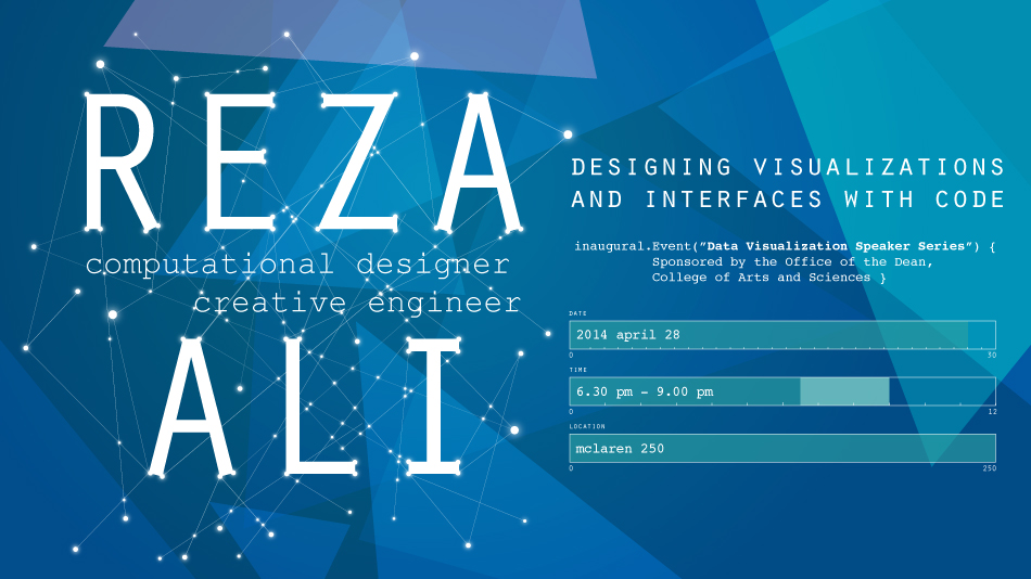
The Data Visualization Speaker Series presents:

Reza Ali
Designing Visualizations and Interfaces with Code
Monday, April 28, 2014
6:30pm to 9:00pm
McLaren, Room 250
Reza's talk will explore the process of designing and implementing interfaces and generative visualizations. He will showcase his most recent works and address the aesthetic considerations and challenges involved in creating each piece.
Schedule
| Time | Description |
|---|---|
| 6:30 – 7:15 | Doors open, socializing, food, drinks |
| 7:15 – 8:15 | Speaker's presentation |
| 8:15 – 9:00 | More socializing, Q&A |
Bio: Reza is a computational designer and creative engineer. He uses code to express himself, and creates tools and libraries to help others create. He is the author of ofxUI, one of the most popular add-ons for openFrameworks (an arts-engineering toolkit). Though his works is highly visual, he is interested in the ideas and implications of his tools, works, and methodology. As an artist and engineer he is deeply interested in the feedback cycle that occurs when customs tools are written to accomplish an artwork, and how those tools can enable artworks to go beyond what the artist had originally envisioned. Reza is excited to find those happy accidents, beautiful moments of interaction and magic that comes with making something novel with technology. He hopes to change the world by making a difference in how people use technology, design products and experience new media art and entertainment.
Notice: Attendance at this event is mandatory, and will replace lecture on Tuesday 4/29. (We will not meet on Tuesday 4/29 as a result.)